
It’s time for this week’s edition of Crap Chart of the week.
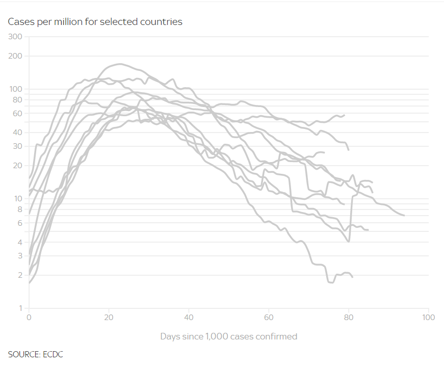
This chart is showing on Sky News, let’s compare different countries using the same colour scheme and no key??
It’s time for this week’s edition of Crap Chart of the week.
This chart is showing on Sky News, let’s compare different countries using the same colour scheme and no key??